Lexend: A Font is Changing the Way the World Reads

Lexend: A Font is Changing the Way the World Reads
Bjoern Meyer
Fonts
Lexend: A Font is Changing the Way the World Reads
Summary:
Google Docs introduced a new font named Lexend that is explicitly designed to improve reading speeds. This articles gives some background information about the development of this font.
The Buzz Around Lexend
Google announced that a new font is available in Docs, Sheets and Slides that was explicitly designed to improve reading speeds. The new font Lexend was developed by Thomas Jockin based on research studies. The font has been discussed in Stanford labs, at HP and Microsoft, was listed on Apple K-12 Assistive Technology from 2003-2005, has been referenced in research and patents by Adobe and has been released by Google Fonts as a variable font.
Something must be interesting about this font.
As prescription eyeglasses achieve proficiency for persons with short-sightedness, Lexend employs variable font technology to prescribe a personalized axis setting according to the Shaver-Troup Formulations.
Optimizing Reading Performance
The digital world makes the ability to read quickly and efficiently essential in nearly all situations. From e-books, digital publications, websites and social media - the amount of information to read is growing.
Reading is a rapid process. The recognition of characters, words and connections occurs in nanoseconds. Every distraction can interrupt this process. This could be a typo, a change in the font size, an uncommon word wrap or anything else that distracts the reader for a very short time.
The Solution
The educational therapist Bonnie Shaver-Troup observed in 1999 that reading issues masked the individual’s true capability and intelligence. Shaver-Troup figured out that reading issues were a sensitivity to typographical factors. Step-by-step, she experimented with different factors such as shape, size and spacing to find a match between the text format and the individual visual processing abilities.
Shaver-Troup theorized that the reading performance improves with 3 factors:
- Character spacing creates a greater lag time and reduces potential crowding effects.
- Expanded scaling
- Sans-serif fonts reduces noise.
Based on this research, she created the six formulations that alter text format that creates an immediate improvement in reading performance.
| Shape | Size | Space |
|
|
|
These six formulations created a significant improvement in reading fluency for most readers and offer a good framework for better text rendering.
Fluency is defined as the ability to read with speed, accuracy, and proper expression. In order to understand what they read, readers must be able to read fluently whether they are reading aloud or silently. When reading aloud, fluent readers read in phrases and add intonation appropriately.
Fluency is measured in WCPM (words correct per minute)
- Number of Words (Sample: 556 words)
- Number of Mistakes (Sample: 28 words)
- Words - Mistakes = Correct Words (Sample: 556 - 28 = 528)
- Time to read in seconds / 60 (Sample: 90 seconds / 60 = 1.5)
- Divide the Correct Words by the Time to read (Sample: 528 / 1.5 = 352 WCPM)
The following chart shows values of an interesting experiment with students reading text using the fonts Times New Roman vs. Lexend.
20 third graders read a 16pt text for one minute in five fonts. Each student reads out loud a passage set in Times New Roman, then four with one of the Lexend font variations — Regular, Deca, Mega, and Giga.
The Google Font Lexend
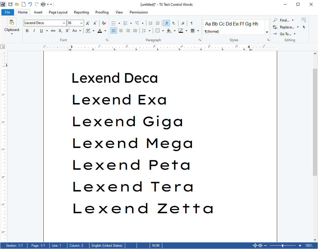
Below is a font sample of the 7 different Lexend styles that are available in Google Docs and also Google Fonts, the open font directory from Google:
Lexend Deca 20pt
Lexend Exa 20pt
Lexend Tera 20pt
Lexend Peta 20pt
Lexend Giga 20pt
Lexend Zetta 20pt
Lexend Mega 20pt
Lexend in TX Text Control
We tested the Google font Lexend in our word processing component TX Text Control. The results can be seen in the screenshot below. Not only is the font perfectly rendered and readable, but also a pixel-perfect, beautiful font for all types of business documents. Increase the reading performance of your document recipients and try this new font in your TX Text Control based applications.
Conclusion
Google published the font Lexend that uses variable font technology according to the Shaver-Troup formulations that improve the reading performance significantly.